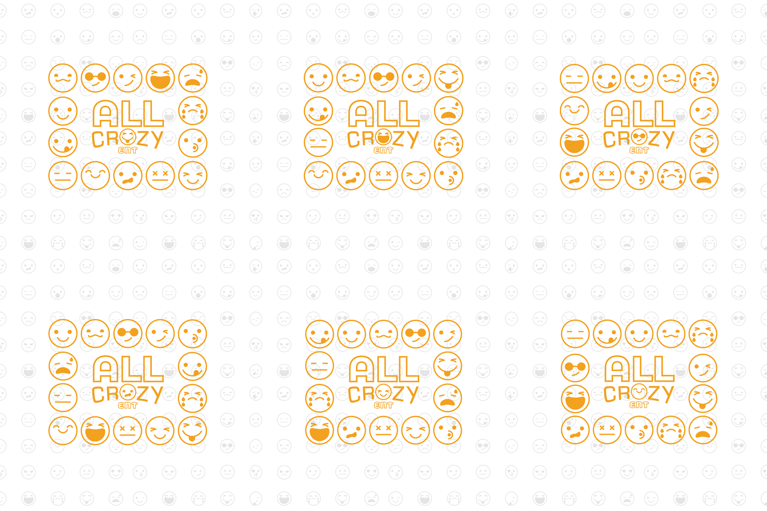
All Crazy is an entertainment and event planning company with a goal to inspire people of all ages to embrace individuality and freedom of expression.
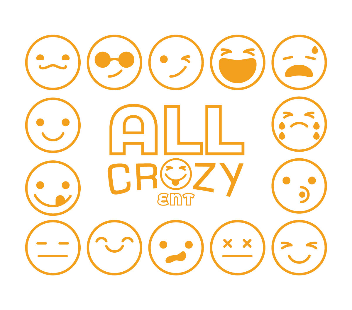
The idea of the logo was based off of expressions of emotions. The client wanted to use emojis/emoticons to represent the different expressions that people show. The text was meant to give an old school arcade feel as well as.
Colors/Fonts: Monsterrat Bold/Eurostile
The client felt drawn to the color yellow/orange. They wanted the color to be bold and rich almost like a bright golden color.
