Health Choice, Medical + Dental
As the name suggests Health Choice is a company that combines your essential visits of the doctor and dentist under one roof. I was challenged to convey this in a simple icon with sharp thin text that will contrast the curvy icon.
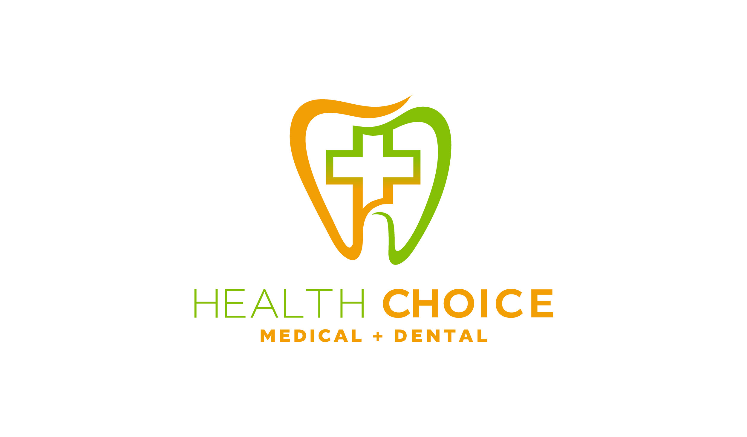
The tooth and cross combined to make a nice clean icon. The gradient was used to further illustrate a seamless transition between businesses that operate in the same space.Fonts + Colors
Altivo and its variations offer a versatile selection within the same family. The thin variation offers a sharp clean type that is still legible without getting overpowered by bolder variants used in the same design. The orange and green colors contrast well on black, white and navy blue backgrounds.
